Module Two, “Design Principles for Effective and Accessible Multimedia,” was a truly captivating experience that deeply engaged my interest. This module not only expanded upon my existing knowledge but also introduced me to new concepts, including the Universal Design for Learning approach, inclusive design, and the web accessibility evaluation tool WAVE.
Through the process of creating my infographic using Canva, I had the opportunity to apply and display these newfound principles and concepts. This hands-on experience allowed me to bring these principles to life and gain a more profound understanding of their practical implications.
Reflection questions:
What did you find when you ran the WAVE accessibility report on your blog post(s)? What did you expect and what was surprising? Is there anything you will do differently going forward?
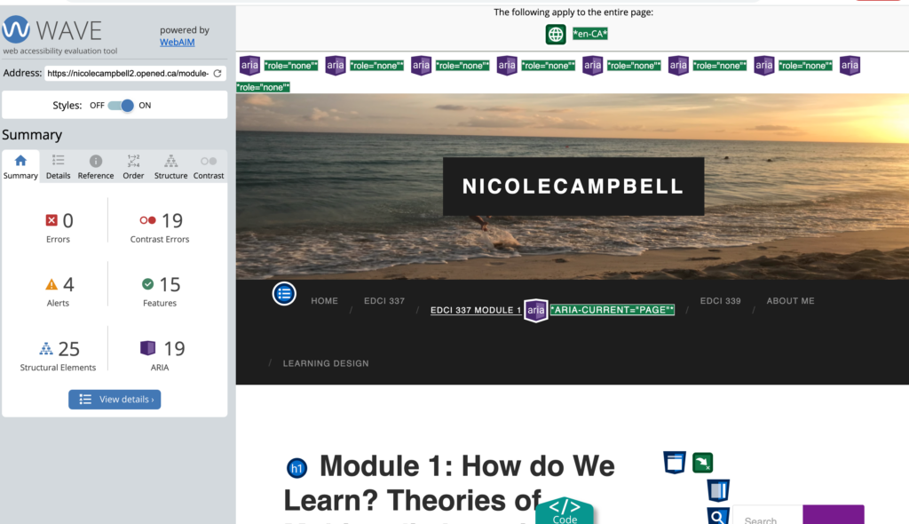
This module led me to venture into the realm of web accessibility evaluation by plugging my WordPress URL into the WAVE tool. The result was a comprehensive summary report encompassing module 1 posts, errors, contrast issues, alerts, features, structural elements, and ARIA attributes. Interestingly, there were no errors found, but I did encounter 19 instances of contrast errors.
Despite having no errors, I did receive 19 contrast errors. This report shed light on a specific concern: certain colours within my website exhibited low contrast levels, especially in areas such as my tags section and the bottom section containing my archives, meta information, and attributions. This revelation from WAVE prompted a realization – I needed to adjust my site’s colour scheme to rectify these contrast issues. By addressing this concern, I aim to enhance the inclusivity of my website.
My exploration of the WAVE web evaluation tool was a truly enlightening experience. It underscored the significance of providing accessible resources and alternatives in the quest for universal inclusivity. As I progress in my educational technology journey, I am increasingly aware of the importance of making digital content accessible to all, and I’m committed to applying this knowledge to create a more inclusive digital environment.
What does inclusive design mean to you?
What does inclusive design mean to you? In my understanding, the essence of inclusive design is best encapsulated by two insightful quotes. Firstly, according to Microsoft Design Principles (2018), Inclusive Design is defined as “a methodology, born out of digital environments, that enables and draws on the full range of human diversity. Most importantly, this means including and learning from people with a range of perspectives”. Secondly, Kat Holmes states “At the heart of these design principles is the recognition that disability isn’t a lack of ability, it’s a mismatch between a person’s abilities and their environment” (Holmes, 2019).
Within the Interactive and Multimedia Learning course, the concept of inclusive design assumes a central role. Inclusive design represents an approach to designing products, tools, environments, experiences, and even lifestyles with the primary goal of ensuring accessibility and usability for a broad spectrum of individuals. This approach underscores the critical importance of consistently offering adaptations and modifications. These adjustments are integral in eliminating barriers, preventing exclusion, enhancing the efficiency of the learning process, and ultimately crafting solutions that cater to the diverse needs and preferences of all participants.
At its core, inclusive design is rooted in the principle of embracing and supporting every individual, regardless of their age, abilities, cultural background, or disabilities. It embodies the belief that diversity is an intrinsic element of the learning experience, and by embracing this diversity, we can cultivate a universally inclusive and enriching learning environment for all.
Have you used Text to Speech tools before? Did you find it useful? Did you try out some of the different voices? What impact did the different voices have on your ability to absorb information?
This module delves into the evolution of Text to Speech tools, tracing their origins back to the 1950s and highlighting the remarkable technological advancements that have brought them close to emulating natural speech. It emphasizes that Text to Speech is among the most commonly employed adaptive learning tools, a resource I frequently incorporate into my own learning journey.
This tool plays a pivotal role in promoting universal inclusivity for individuals with visual impairments. Although I do not have a visual impairment, I’ve always had reservations about extensive reading. However, this feature has significantly enhanced my engagement with course materials and personal literature. Moreover, as someone who experiences migraines triggered by prolonged screen exposure, Text to Speech offers me an alternative means of acquiring knowledge. Personally, I have observed that this tool has led me to engage with more content, particularly through platforms such as audiobooks. While the lifelike voices are intriguing, I do not frequently utilize them, primarily due to my apprehension regarding technology. Although exploring different accents can be entertaining, it tends to be more of a distraction than an effective way for me to absorb information.
Beyond its applications in learning, Text to Speech tools also serve as a safety feature. For instance, while driving, these tools provide a hands-free option to receive navigation directions aloud and to listen to and respond to messages, contributing to enhanced road safety.
Conversely, Speech to Text technology contributes to inclusivity for hearing-impaired individuals and offers valuable societal benefits. For instance, when watching lecture recordings or movies, subtitles provide clarity and improve my understanding of the content being discussed.
By enhancing accessibility and providing alternative means of consuming information, Text to Speech and Speech to Text tools prove to be invaluable assets for both learning and daily life. I recognize that these tools yield numerous benefits, including reducing the risk of migraines, enhancing information absorption, promoting road safety, and ensuring accessibility for all individuals, especially those with hearing and visual impairments. This aligns with Kat Holmes’ second principle in her inclusive design approach, as she aptly states, “Designing for people with disabilities actually results in designs that benefit people universally” (Holmes, 2019). Holmes’ approach comprises three principles: “Recognize Exclusion,” “Solve for One, Extend to Many,” and “Learn from Diversity” (2019).
Which design principles did you use to create your infographic in Canva? Which elements of a ‘good infographic’ were you able to incorporate? What other principles did you consider? What does the template make easier and what does it make harder when creating your infographic?
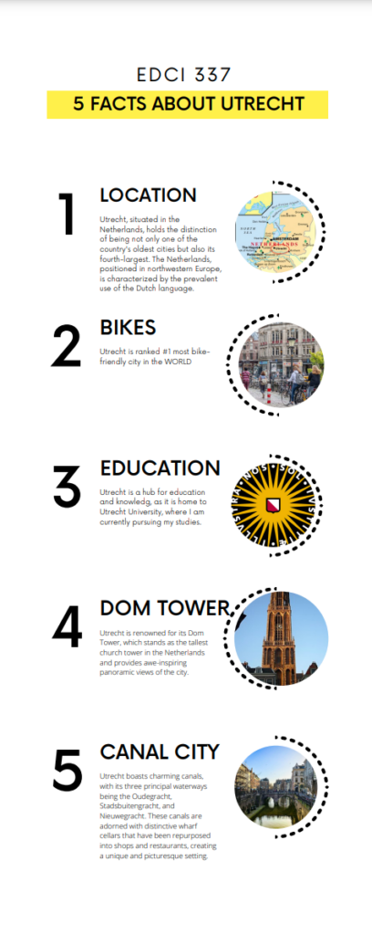
In the process of crafting my infographic using Canva, I conscientiously applied various design principles to ensure its effectiveness. To begin, I considered the feedback I received from my WAVE assessment, where one crucial aspect was to avoid the use of contrasting colours, which might pose accessibility challenges. This feedback informed my colour choices during the design process.
Furthermore, I embraced the six fundamental practices recommended for designing infographics (Easel.ly, 2021). A minimalist approach guided my design choices, encompassing colour usage, imagery selection, and font styles and sizes. This approach was pivotal in creating an infographic that was not only visually engaging but also easy to comprehend.
I argue that Canva’s template library played a significant role in shaping the creation process and the final outcome of my infographic. I mean this is not surprising considering Canva offers 6,766 infographic templates which vary dramatically.
In the video “How to Create an Infographic – Part 1: What Makes a Good Infographic?” covers 9 steps to make a good infographic (Visme, 2017). To align with this assignment’s objective, I opted for a simple yet aesthetically pleasing design. This aligns with step 7 of a good infographic with my focus of creating a visually appealing infographic (Visme, 2017).
I did make some minor adjustments to the chosen template, including the addition of relevant images and the consistent use of font sizes and styles, in line with the six recommended practices (Easel.ly, 2021).
In my specific assignment, my aim was to present factual information rather than construct a story. To achieve this, I closely followed the “good infrastructure model,” with particular attention to Step 5 (well-structured), Step 6 (conveying one key message about Utrecht), and Step 9 (keeping the text concise and to the point) (Visme, 2017).
In summary, the principles and practices I applied to create my infographic in Canva were geared toward making it accessible, visually appealing, and conducive to effectively delivering key information about Utrecht. Canva’s versatile template library allowed me to tailor my design to meet the specific requirements of my assignment.
Infographic References:
https://images.app.goo.gl/6C2cHhk9aCFnKWNs5
https://images.app.goo.gl/kxPqnuFyxZ3kSfok9
https://images.app.goo.gl/zbJ4hoEphMTWm3Gp6
https://images.app.goo.gl/QA5MsueXFoX9Ztfm8
https://images.app.goo.gl/oFoGNwL76CrUqnDT8
References:
Holmes, K. (2020). Mismatch: How inclusion shapes design. MIT Press.
Inclusive Design (2018) Microsoft Design Principles
Easel.ly, Crash Course in Infographics Webinar, Accessed Sept 28, 2022
Mayer’s 12 Principles of Multimedia Learning. (2023, June 2). Digital Learning Institute. https://www.digitallearninginstitute.com/blog/mayers-principles-multimedia-learning/
Hi Nicole!
I really enjoyed reading your reflection on Module Two. It’s clear that this module has sparked a sense of curiosity and engagement within you, expanding your knowledge while introducing you to new concepts, such as the Universal Design for Learning approach, inclusive design, and the web accessibility evaluation tool WAVE. I find your enthusiasm for these topics both inspiring and relatable, as I can also share your passion for creating accessible and effective multimedia.
Your experience with the WAVE accessibility report is quite enlightening. It’s interesting to note that, while you didn’t find any major errors, the report revealed 19 contrast errors. This revelation is a testament to the subtle yet vital aspects of web design that are often overlooked. I can relate to the feeling of wanting to ensure a more inclusive digital environment. As I embarked on this course, I, too, ran the WAVE accessibility report on my website, and it was eye-opening. It’s remarkable how this tool can shine a light on potential accessibility issues, even when we think our content is error-free.
Your commitment to addressing the contrast issues on your website is great and reflects a deep understanding of the principles of inclusive design. In the process, you’re not just enhancing the accessibility of your site; you’re also creating a more welcoming and user-friendly space for a diverse audience. This aligns perfectly with the core tenets of inclusive design and Universal Design for Learning, which stress the importance of embracing diversity in all aspects of education.
Your definition of inclusive design is beautifully articulated. This notion of including and learning from people with a range of perspectives is both powerful and relatable. In my own journey, I’ve come to appreciate that inclusivity isn’t just about accommodating different abilities but also about understanding and embracing the unique experiences and viewpoints of each individual.
Your experience with Text to Speech tools was also very relatable. Like you, I don’t have visual impairments, but I’ve often found extended reading to be a bit taxing. These tools have been a game-changer for me, making it easier to engage with content, particularly during long reading sessions or when I’m on the go. The idea that different voices can either enhance or distract from the learning process is something I’ve experienced as well. It underscores the need for flexibility and customization to cater to individual preferences.
Your mention of Speech to Text technology is essential, highlighting the bidirectional nature of accessibility tools. While Text to Speech tools benefit those with visual impairments, Speech to Text tools serve those with hearing impairments. This reciprocity underscores the universality of inclusive design and its role in breaking down barriers for diverse learners. I’ve also noticed the impact of subtitles when watching foreign films or video content with complex terminology; they greatly enhance comprehension.
Your approach to creating the infographic in Canva is thoughtful and practical. It’s clear that you’ve internalized the design principles and applied them diligently. I’ve personally found that templates can be a great starting point, but they do require customization to meet specific needs. It’s both a time-saver and a creative challenge. I really enjoyed your canva and thought your layout was simple but effective and easy to follow.
Overall, I really appreciated your commitment to accessibility, your understanding of inclusivity, and your practical experiences with various tools throughout this module. Your enthusiasm for creating a more inclusive and effective learning environment shines through, and I look forward to seeing how you continue to apply these principles in your educational journey and through all of our group work in this course 🙂
Hi Nicole! I loved reading your Module 2 post. I had the exact same errors on my WAVE report! I am glad I wasn’t the only one. I also really liked your quote from Kat Holmes. A mismatch between a person’s abilities and the environment is a perfect way to explain how to approach inclusive design. I also had the same thought about the text-to-speech accents, they are too distracting! I also never thought about the different ways I use text-to-speech like using Siri to read my texts while driving – what an interesting perspective.
I love how you reflected on the WAVE report and implemented it in your infographic by reducing contrasting colors. I did read that contrasting colors are good for infographics. I wonder how teachers should find a happy medium between the two schools of thought. Your infographic is easy to read and since you used the personalization method, I felt more drawn to read it as it told me about yourself. I also appreciate you standardizing the text to follow one of the six recommended practices.
Thank you so much for sharing and I can not wait to read more of your posts,
Maya
Hey Nicole!
My Wave report was similar to yours in that it had no errors, but many counts of contrast issues. When creating my blog I didn’t think to adjust the colors because to me they looked okay, it really is eye-opening to see these things from a different perspective.
I enjoyed the section of your blog about Text to Speech and using it for driving as a hands free option, I use this feature all the time and didn’t really process that it was a text to speech function! When I wrote my blog I noted how I used text to speech for things such as listening to audiobooks, but I didn’t think about things such as navigation- that was a really great point. I definitely use text to speech more than I thought I did.
I enjoyed looking at your infographic – I didn’t know anything about Utrecht, so I enjoyed getting a couple quick facts about it. I like the use of simple fonts and engaging photos. It was easy to follow yet still engaging and interesting.
This was a great blog to read Nicole, thank you for sharing your insights!
Hi Nicole! I loved reading your Module 2 post. I had the exact same errors on my WAVE report! I am glad I wasn’t the only one. I also really liked your quote from Kat Holmes. A mismatch between a person’s abilities and the environment is a perfect way to explain how to approach inclusive design. I also had the same thought about the text-to-speech accents, they are too distracting! I also never thought about the different ways I use text-to-speech like using Siri to read my texts while driving – what an interesting perspective.
I love how you reflected on the WAVE report and implemented it in your infographic by reducing contrasting colors. I did read that contrasting colors are good for infographics. I wonder how teachers should find a happy medium between the two schools of thought. Your infographic is easy to read and since you used the personalization method, I felt more drawn to read it as it told me about yourself. I also appreciate you standardizing the text to follow one of the six recommended practices.
Thank you so much for sharing and I can not wait to read more of your posts,
Maya
Hi Nicole,
I also found WAVE super interesting as it gave me a different perspective on my website. Similarly, I also had the most contrasts in my WAVE summary but did not make any changes because I like the combination of the dark background and white text boxes of my website. However, I can see how it can be a helpful tool and plan to use it in the future. I found your explanation of text-to-speech super interesting. I can definitely agree that it has helped me in the past when I am having trouble focusing while reading. I wanted to also say you did a great job on your infographic and your approach of simplicity made it super easy to follow along but also engaging. I can definitely see you put the extra time into creating your infographic. Thank you for sharing!
Hi Nicole!
I loved seeing your blog post 2! Your WAVE accessibility report and mine portrayed similar responses and it is interesting how that happened! I found it extremely helpful in my learning and as you said it pointed out things I would of otherwise not realized and it made me think of how to be more inclusive in my blog style and posts.
I thought your opinion and definition of inclusive design was very insightful. Adapting and modifying for needs is a huge part of it and I like how you pointed that out. It shed light for me on how complicated defining that concept is and I felt you did a great job in creating a good overview of it. The Text to Speech tool is quite interesting for myself. I have found that there is a range of responses and reactions to it and every person is unique in what they have to say. It was interesting to learn how it has helped you in your learning as looking at screens for long periods of time do tend to give me headaches as well. I wonder if you had a voice/ accent that you found worked best for you?
Your infographic was well laid out and was easy to follow along with. The use of negative space was incorporated perfectly and the colour scheme went together nicely. I enjoyed the use of imagery as well as the simplicity of the design so it was not overwhelming to look at. It looks great! I am in agreement with you that Canva’s templates are quite helpful for the creation of infographics. It helps spark creativity as well as gives a good starting point. I find usually adjust it to my needs but love the initial help!
Can’t wait to read more of what you share!
Skye